
Huh. Well, now I think about it, it could be that new sfs loader people have been talking about. I haven't had time to follow it's development though, so I know little about it. But my gut says look into it.
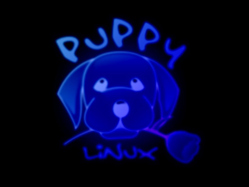
As for wallpapers, the grey default makes the monitor look like it wants to smother me. Too oppressive. Here's some other ones that have more of a Puppy personality (including a mostly black one):
http://www.browserloadofcoolness.com/ar ... r/neon.jpg
http://www.browserloadofcoolness.com/ar ... /white.jpg
http://www.browserloadofcoolness.com/ar ... eached.jpg
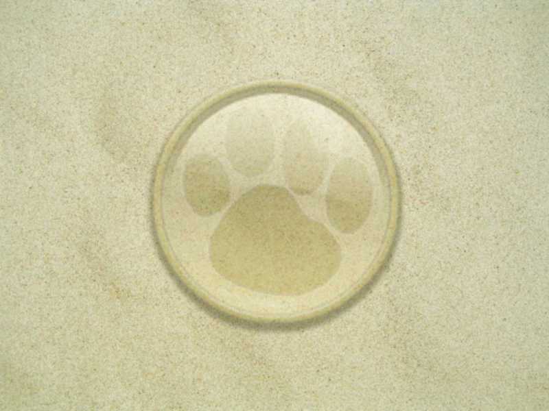
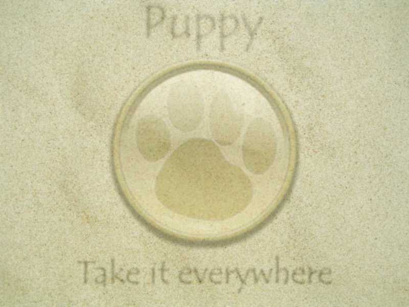
Also, the beach ones I made previously look okay on it too. If the colors were tweaked a little to be more gray than tan it would be better:
http://www.browserloadofcoolness.com/ar ... 00x600.jpg
http://www.browserloadofcoolness.com/ar ... 00x600.jpg
(alternate sizes of these ones are available on my website, among others)
I haven't made any new ones recently, but if nothing's needed for a week or so I could make a gray/blue one specifically for 2.16 either between or after my exams. I've been itching to play with my new Wacom tablet, but I've been too busy with school lately to do anything. Fortunately next week is finals week.
2.16 Alpha
-
Pizzasgood

- Posts: 6183
- Joined: Wed 04 May 2005, 20:28
- Location: Knoxville, TN, USA
Mount .sfs in 216 alpha
To devc51,
May be you will run the sfsinstaller to install your .sfs file. I'd got the same trouble (as your) when I put the .sfs in /home.
Is that the 216 alpha' bug?
May be you will run the sfsinstaller to install your .sfs file. I'd got the same trouble (as your) when I put the .sfs in /home.
Is that the 216 alpha' bug?
for sfs files in 216 you need to use the bootmanager to specify which sfs files you want to load - it works a bit differently than the previous versions and just adding the version number in will not help
the bootmananger is found in the system sub-menu and is pretty self explanatory
after choosing what you want you will need to reboot to get them
George
the bootmananger is found in the system sub-menu and is pretty self explanatory
after choosing what you want you will need to reboot to get them
George
george
Getting 215.sfs Files to Work
I renamed the OO and Web sfs files, ran the bootmanager as Vern suggested, and I have both OO and my beloved Firefox. Nothing was added to my menus, but I just dragged a copy of the icons from /usr/loca/bin to my desktop.vern72023 wrote:for sfs files in 216 you need to use the bootmanager to specify which sfs files you want to load - it works a bit differently than the previous versions and just adding the version number in will not help
the bootmananger is found in the system sub-menu and is pretty self explanatory
after choosing what you want you will need to reboot to get them
George
All this strengthens my conviction (probably an illusion) that Puppy can do everything.

Re: Getting 215.sfs Files to Work
Your menu entries should show up if you run fixmenus from a console and then restart the WM. Open Office will show as a submenu under Documents. Not sure if Firefox and Thunderbird end up under Internet, but they should.davec51 wrote:... I have both OO and my beloved Firefox. Nothing was added to my menus, but I just dragged a copy of the icons from /usr/loca/bin to my desktop.
All this strengthens my conviction (probably an illusion) that Puppy can do everything.
Cheers
[i]Actions speak louder than words ... and they usually work when words don't![/i]
SIP:whodo@proxy01.sipphone.com; whodo@realsip.com
SIP:whodo@proxy01.sipphone.com; whodo@realsip.com

earlgrey.jpg - another grey background for 2.16
Here's a grey background for 2.16 I created in mtPaint that's not too distracting. I called it earlgrey.jpg. It's 1024x768 and only 56K. Download it by right-clicking on the image and choosing 'Save Image As...'

Methinks Raspberry Pi were ideal for runnin' Puppy Linux
-
Lobster

- Official Crustacean
- Posts: 15522
- Joined: Wed 04 May 2005, 06:06
- Location: Paradox Realm
- Contact:
Showtime!
I like it pakt.
When I first started using it Puppy I was well aware that it had the best most flexible useful structure. It did not look great but it was. From the start Puppy seemed very different. Slowly and gradually we have become a prettier distro. We are kind of the Wii Linux. Not the most glamorous but the most playable . . .
Now then . . . people come to the grey and they 'must change' and they can . . .
I am using 2.16 at the moment and the plain grey is very unobtrusive. Puppy does not belong to the Glitz tradition of Linux but after a visit to the Puppy parlour we have Viz, Grafpup, Rudy, Pizzapup and all manner of enhancement.
I am panting for Beryl . . .
Sorry, Sage, but ergonomically a light background is superior. Here's an excerpt from Visual Ergonomics in the Office:Sage wrote:Still think the evidence for a stunning black background is superior. Indeed, here is a link for a black background
SCREEN COLORS
* Screen colors: dark letters on a light background.
With the monitor off, look at your reflection in the screen. Now turn the monitor on and select a Windows-type background, (black letters on a white background). Notice that you cannot see your reflection as well.
Contrast is simply the difference in brightness between two images. With a white background, we reduce the difference in contrast between the screen and what is reflected off of it.
Negative screen contrast (black letters/white background) can reduce reflected images, as we saw with the demonstration. A white background also reduces the luminance (brightness) difference between the screen and the surrounding background of a normally lighted office. That makes it easier on your eyes.
Most early monitor screens had a black background with white, green or amber characters. Although white backgrounds were possible, the low quality of the monitors meant that the screen would flicker noticeably. Although newer technology has reduced the necessity, there are still many software programs with dark backgrounds.
Methinks Raspberry Pi were ideal for runnin' Puppy Linux
We don't have to worry about all that now pakt - and there's no reflection from most lcd screens. The difference in power saving and lifetime extension is significant, anyway.
As for contrast - not correct. In the early 80's, Alan Sugar deployed yellow on dark blue to overcome the primitive technologies available at that time. He is reputed to have consulted on the issue. It certainly worked. He would have been running the PC industry worldwide now had it not been for dirty tricks by transatlantic bullies. Sound familiar?!
Apart from which, the guys on your link are utterly wrong. Try it! A black background is far less strain. This fact is both subjectively as well as intuitively evident!
-
Lobster
- Official Crustacean
- Posts: 15522
- Joined: Wed 04 May 2005, 06:06
- Location: Paradox Realm
- Contact:
?Sage wrote:Try it! A black background is far less strain.
tried it Sage. Many times. many monitors. Many conditions.
In theory yes. In practice I find black on white background more legible.
We dont use black paper with white print.
That is why grey is a good compromise for those extolling the virtues of their preference - which clearly don't appear black or white . . .
Sage, you obviously require a bit more convincing so here are two more excerpts from serious ergonomics sources:
From FAQ at http://www.netsci.org/Science/Special/feature01.html
(the lower the points the better)
Sage, please show me a serious reference that recommends what you suggest: light characters on a dark background.
From FAQ at http://www.netsci.org/Science/Special/feature01.html
From http://www.northwestern.edu/risk/Ergo.htm, excerpt from the "Ergonomic Survey to see if you have task/risk factors"5)Q. Is there an optimum screen brightness and color scheme to help prevent eye strain?
A. Black characters against a light gray background are often easiest on the eyes for long periods. Its suggested that contrast and brightness should be adjusted to create the brightest screen without blurring.
(the lower the points the better)
I could find any number of authoritative sources supporting this: for best computer ergonomics, ie, to make is easier on the eyes, you should have dark characters on a light background.4. The primary screen used has:
a. A very light background with dark characters similar to print on paper (2 points)
b. A light colored background with darker characters (4 points)
c. A dark colored or black background with light characters (8 points)
Sage, please show me a serious reference that recommends what you suggest: light characters on a dark background.
Methinks Raspberry Pi were ideal for runnin' Puppy Linux
Have you tried it yet?!This fact is both subjectively as well as intuitively evident
The eye is a remarkable instrument. It can discriminate a candle flickering at three miles. It is degraded by bright lights which tend to saturate the rods and cones all too easily. Everyone knows this - try shining a torch into one eye - it takes a few minutes to recover. The phenomenon of persistence of vision is known to every schoolchild. Furthermore, once your eyes accostom themselves to a 'dark' room, most folks begin to discern the objects around them, since the complete absence of light is difficult to achieve. You may get a good view of the stars up there in the archipelagos, but down here in our crowded towns (and countryside), we are blighted by street lights, commonly referred to as light pollution.
So, go on try a black background and see how much you will like it and how soothing it is on the eyes. If you wish, put up yellow text. The nearer you can get to a green text and still resolve it the better as there is a sharp dip in response in this part of the spectrum.
Light, especially toward the blue end, degrades nearly everything organic ie based on carbon, that includes people! The chemistry is irrefutable.

Ahh....... let there be a light-errrr touch on this.....
> The Sky ?
In the beginning - there was no light - so God said "Let there be Light"
& by G - there was
In "The Beginning" There was nothing but dark
Nothing however, could be seen.
So G created light: nothing could still be seen - but it was now evident, since in all wisdom > light had been cast on the subject
So you see, Ergo - How this is "felt" is now the topic.
Seeing the background is as dark as ever it was In the Beginning
Sage, do ya follow the code ?
Oh BTW - colour as we see it - is NOT
light characters on a dark background
> The Sky ?
In the beginning - there was no light - so God said "Let there be Light"
& by G - there was
In "The Beginning" There was nothing but dark
Nothing however, could be seen.
So G created light: nothing could still be seen - but it was now evident, since in all wisdom > light had been cast on the subject
So you see, Ergo - How this is "felt" is now the topic.
Seeing the background is as dark as ever it was In
Sage, do ya follow the code ?
Oh BTW - colour as we see it - is NOT
Too true - as we've observed before, nothing is what it seems. Red is blue and blue is red. Who's that walking on the ceiling?
Glad you were able to shed light on the matter - or anti-matter, if travelling in the parallel of our own space-time continuum.
And, on that note, I just know that Lob is going to want to join the party.
Glad you were able to shed light on the matter - or anti-matter, if travelling in the parallel of our own space-time continuum.
And, on that note, I just know that Lob is going to want to join the party.
To continue -umm: Isn't that Approx when I came in ~
The Lobster Quadrille ?
"Will you walk a little faster" said a whiting to a snail -
"Theres a purpose close behind me" - and he's treading on my tale.....
Who will come and join the dance
~ The snail replled; "Too far too far" & gave a look askance
"What matters it how far we go?" his scaly friend replied.
"There is another shore, you know, upon the other side."
-
Lobster
- Official Crustacean
- Posts: 15522
- Joined: Wed 04 May 2005, 06:06
- Location: Paradox Realm
- Contact:
I am busy trying to buy a 'Dimensional Warp Generator'
http://tmxxine.com/pligg
. . . as for the dark side of the force (and the screen)
In the realm of the Grey Lords, harmony is achieved by balancing the complimentrary elements.
The important thing is not what is right or wrong, for that is dependent on perception and persuasion.
What is important is what works. This is why Linux allows the followers of light to shine and the followers of the void to empty the lighter side . . .
I follow the Middle Way . . .
The Middle way has four truths*
Existence includes Darkness
Darkness has a cause
Light exists
Follow the 8 fold Puppy
* based on the four Noble Truths of Buddhism

http://www.killingthebuddha.com/
old gods, new tricks
http://tmxxine.com/pligg
. . . as for the dark side of the force (and the screen)
In the realm of the Grey Lords, harmony is achieved by balancing the complimentrary elements.
The important thing is not what is right or wrong, for that is dependent on perception and persuasion.
What is important is what works. This is why Linux allows the followers of light to shine and the followers of the void to empty the lighter side . . .
I follow the Middle Way . . .
The Middle way has four truths*
Existence includes Darkness
Darkness has a cause
Light exists
Follow the 8 fold Puppy
* based on the four Noble Truths of Buddhism
http://www.killingthebuddha.com/
old gods, new tricks
-
Pizzasgood
- Posts: 6183
- Joined: Wed 04 May 2005, 20:28
- Location: Knoxville, TN, USA
Try reading anything on a white background in a dark room at 3am. Even if you do overcome the pain and make your eyes adjust, as soon as you finish and stand up, you'll fall flat on your face because your roommate left a chair in the middle of the floor.  With a dark background you don't hurt your eyes and your night vision isn't quite so depleted, so hopefully you'll see that chair.
On the other hand, though dark backgrounds aren't very bright during the day, they don't hurt your eyes.
As for green or white on black, it's just too much contrast. I always reset my terminal to use black a background and gray text. (My desktop icons generally don't have text, just an image, so that's why I'm talking about terminals.)
[size=75]Between depriving a man of one hour from his life and depriving him of his life there exists only a difference of degree. --Muad'Dib[/size]
[img]http://www.browserloadofcoolness.com/sig.png[/img]
[img]http://www.browserloadofcoolness.com/sig.png[/img]