Shining Walpapers
Posted: Fri 09 Mar 2007, 08:03
Some of you may recognize some of these from the 2.15CE betas. WhoDo made a green version of the original blue one I posted, but since that blue one was already compressed with JPEG, his wound up being huge to maintain the same quality. So decided to dig up the PNG version I'd saved so I could make a green one that's as small as the blue one. While I was at it, I came up with two other varieties. This time, I also uploaded the lossless PNG files in case people want to modify them without losing stacking amounts of quality.
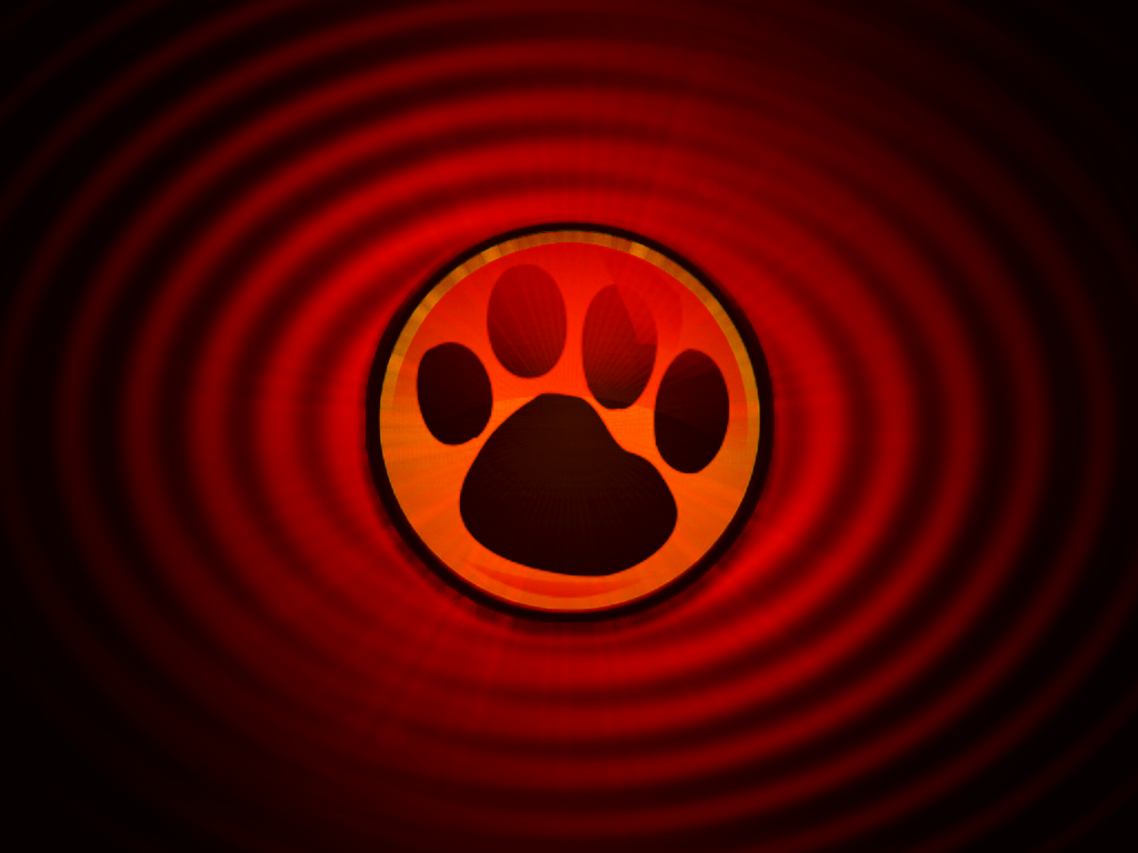
These were made with The Gimp in Pizzapup 3.0, using the famous paw-print of psr1's daughter. I just did the special effects (ripples, lens-flares, crazy glowing psychotic shininess, etc).

shining-blue-1024x768.jpg
shining-blue-1024x768.png

shining-green-1024x768.jpg
shining-green-1024x768.png

shining-red-1024x768.jpg
shining-red-1024x768.png

shining-spotlight-1024x768.jpg
hining-spotlight-1024x768.png
Feel free to enjoy. Personally though, I think I might just go to sleep now.
